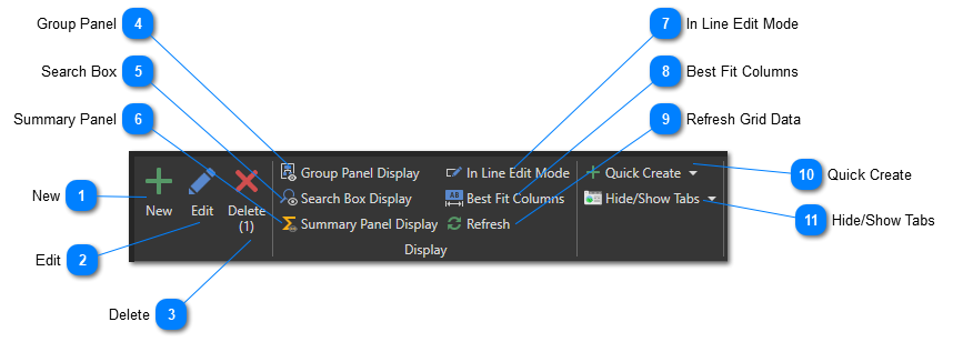
This article explains the common features of data grids across the application.
The following features are available in most data grids. You can access it via the buttons at the top of the grid or by invoking the contextual menu by right-clicking on the grid:
New
Click this button to add a new item to the data grid. An empty form will open so you can fill in the information required to create the item.
Click this button to modify the item that currently has focus in the data grid. A form populated with the data of the selected item will open so you can modify it.
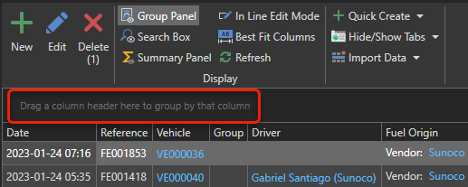
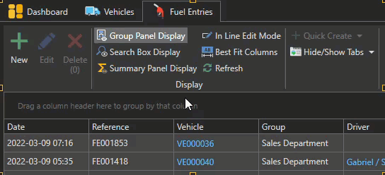
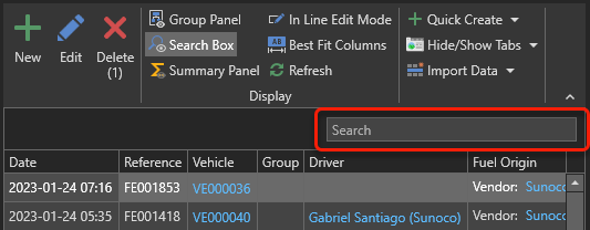
Click this button to toggle the display of the grouping panel at the top of the grid:
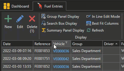
The grouping panel allows you to group the data of the grid by adding one or more columns to it. For example, when the grouping panel is displayed, you can group the Fuel Entries list by vehicle by dragging and dropping the "Vehicle" column header into the grouping panel:
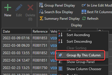
You can also group by a column at any time by right-clicking on the header of a column and then clicking on the "Group By This Column" menu:
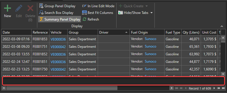
Click this button to toggle the display of the summary panel at the bottom of the grid:
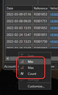
The summary panel allows you to display an aggregation of the column data by right-clicking in the summary panel under the desired column and then selecting an aggregation formula. For example, for a column containing data of the "Date" type, you choose the "Min", "Max" and "Count" aggregations, allowing you to display respectively the smallest date ("Min"), the largest date ("Max") or the number of dates ("Count") displayed in the column:
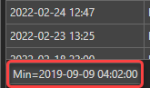
In this case, using the "Min" function, we will obtain the following value in the summary panel:
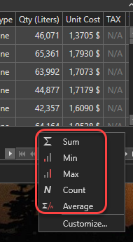
For a column with numeric data, the "Sum" (the sum of the column data) and "Average" (the average of the column data) functions will be available, in addition to the functions described previously:
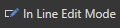
Click this button to toggle the data edit mode. When the "In Line Edit" mode is activated, it is possible to modify certain data of the grid by typing the information directly in the grid:
Changes are saved when the row loses focus. You therefore only have to click on another line to save the data.
Note
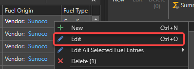
Not all data can be edited via "In Line Edit" mode. When you click on a grid cell and the data cannot be modified, it means that it must be modified via the edit form. In this case, right-click on the item and use the "Edit" button to open the item's form and make the changes:
Also note that not all grids allow "In Line Edit" mode. Although most allow it, the complexity of some grids does not allow using the "In Line Edit" mode. In this case, the "In Line Edit Mode" button will not be visible at the top of the grid.
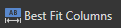
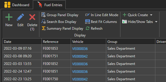
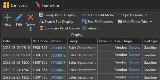
Click this button to automatically adjust the width of all grid columns to the currently visible content. The width of the columns will adjust so that the content of the visible columns is completely displayed, no more, no less. For example:
Before
After
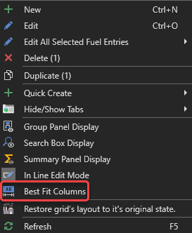
This action can also be triggered via the following contextual menu by clicking on the grid with the right button:
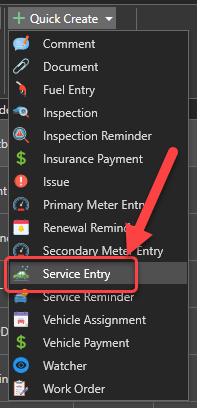
The Quick Create drop-down menu allows you to add a "child" item to the item currently in focus in the data grid. For example, to quickly add a service entry (the child) to a vehicle (the parent), go to the vehicle grid, click on the "Quick Create" button and click on the "Service Entry" menu:
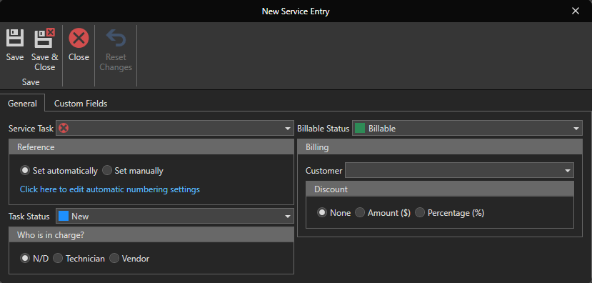
An empty service entry form will open, allowing you to enter the information for the new service entry then save it:
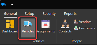
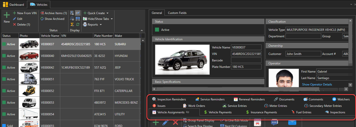
When "child" grids are associated with the main grid (the parent), the "Hide/Show Tabs" drop-down menu allows you to show or hide the tabs containing the child grids that you do not need to display. This improves the loading performance of the main grid, in addition to "decongesting" the interface. Take for example the vehicle section:
It includes several child grids:
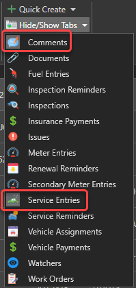
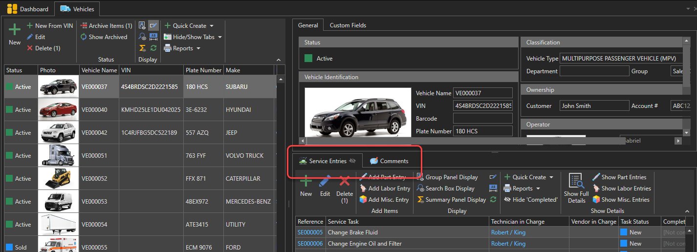
For example, if the only child tabs you want to show are "Service Entries" and "Comments", then you just have to disable the others via the "Hide/Show Tabs" drop-down menu:

